
Article: Branding a Home Decor & Lifestyle brand - 'The Artisen'
Branding a Home Decor & Lifestyle brand - 'The Artisen'
Designers often appear before their clients like seers in plainclothes, ominously declaring that their brand is doomed, lest they employ a professional to design their logo. This warning isn’t all tarot cards and orbs, or a figment of self-important imagination - but a real plea from one realm of professionals to the brands they interact with.
Branding is the voice with which a product speaks - and when it is done correctly, the voice connects with the target audience and helps impart real value to their lives. It’s the story of the product, from manufacturing to functionality in the customer’s hands, made richer and more beautiful by the packaging it arrives in.
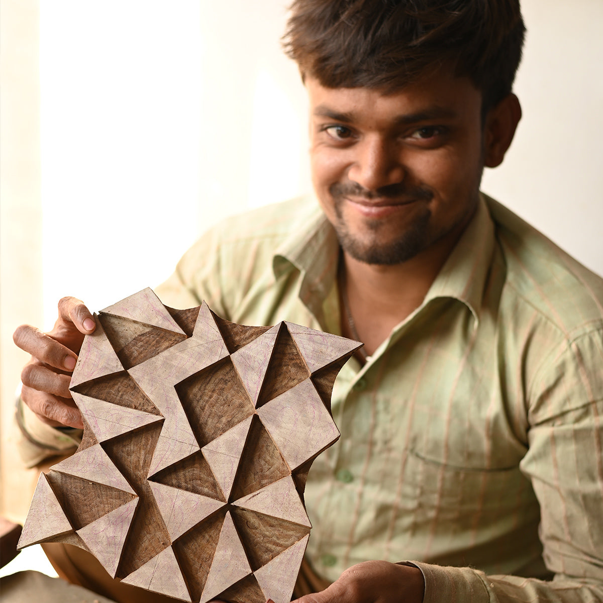
The Artisen understood the importance of branding from the get go and were trusting of my instincts as a design seer. Their message of collaboration with creatives, empowerment of women artisans and promise of quality products struck a chord with my own sensibilities and made my job easy.
A tried and trusted method of beginning any design exercise is asking the fundamental questions of:
- What does the brand wish to convey?
- Why does the brand want to create these products?
- How does it create high quality products?
Having a clear idea of the What, Why and How helps create a congruent design language for the brand and its many communications.
The inspirations behind The Artisen’s logo were the weave, the thread and the dye - processes that are universal to all their products, and indeed dear to the artisans they work with. Yeseva One, the master typeface for the logo, embodied characteristics the brand’s target audience would intrinsically connect with. Its deep contours and graceful symmetry aided in the creation of an elegant, classy logo silhouette.
![]()
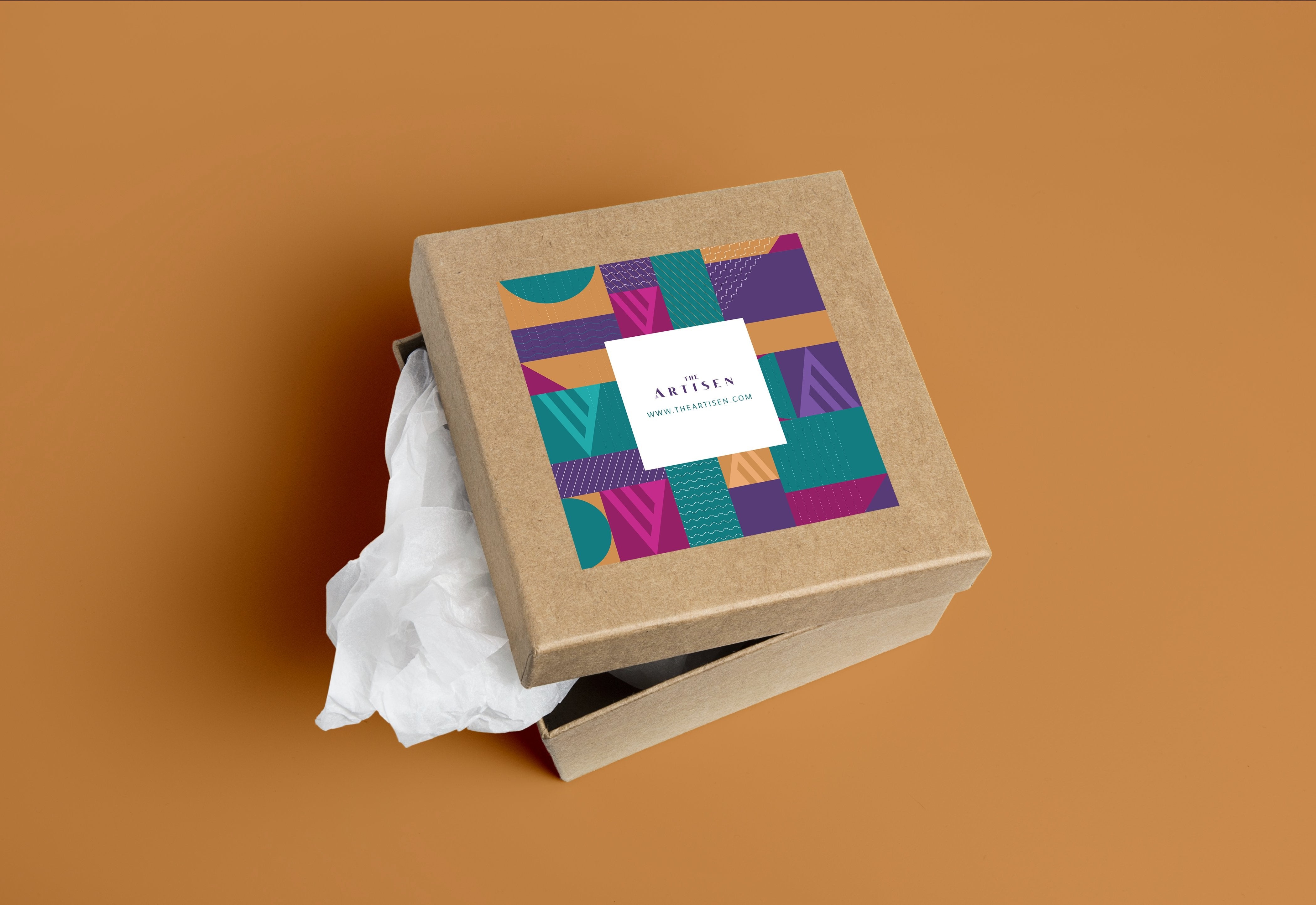
I selected four colours that would help embody The Artisen’s message and remain diverse for use across all mediums. Emerald lended a gender-neutral tone of communication for the brand, while Mulberry and Amethyst remained feminine, though decidedly regal and bold. Camel was chosen to add an element of rustic groundedness.
I furthered the concept of the weave, the thread and the dye through packaging, abstracting the three concepts into icons and symbols that communicated these central aspects of the brand. The intent was to remain bright, bold and approachable, aiming to reflect the brand’s aesthetic and ideological sensibilities through packaging.

As The Artisen takes a step forward in providing value through their beautiful products, I hope their supporters also find joy in the packaging and branding. It is immensely satisfying to see this brand move forward through all their communications, now armed with the right voice and tonality to tell their story.

Read more
6 Tips to Decorate for Small Spaces
Whether you live in San Francisco, London or Manhattan, big city life often means making do with a small apartment. Decorating in these small spaces has different priorities than the decoration you...
Read more